Hello there! Welcome to the Pinkfresh Studio April reveal blog hop! If you came from Agnieszka's blog, you are in the right place! If not, head over to the Pinkfresh blog to start from the beginning.
I have so much fun playing with these embellishment kits that I often use nothing else on a layout besides some essentials, yes that includes paint and mist for me! ;-) I did pull in a few small pieces from the Up in the Clouds collection and previous kits here as well.
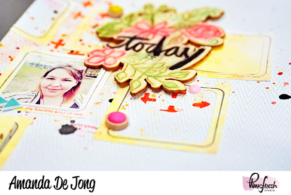
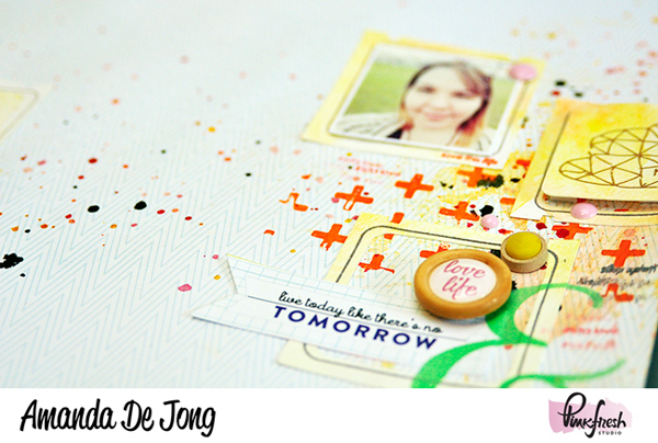
I used the die to cut out several frames from a watercolor background I created and then used the coordinating stamp set to border each frame and add sentiments.
The wood veneer designed by Wilna Furstenberg is just gorgeous! I colored it in with Tim Holtz distress markers and then sprayed a little water on it to bleed the color.
Leave a comment below and on each stop along the way to enter to win the full April kit! And don't forget to stop back at the Pinkfresh Studio blog and comment on your favorites from the hop for your final entry! The winner will be chosen Wednesday the 22nd.
>>>Up next in the hop is Cassandra!<<<
 |
| April Embellishment Kit |
Thanks for looking!


Pretty layout! Love that die to make the frames!
ReplyDeleteThud!!!!
ReplyDeleteThat is my jaw hitting the floor!
This is amazingness! That background - wow! Love the colors too!!!! And all of those frames with the colored wood veneer!?! I can't even! It's incredible! Wow
Wonderful LO!
ReplyDeleteOh nice! Fun design!!
ReplyDeleteOh love the way this layout keeps the eyes moving!
ReplyDeleteI love this layout. I am going to have to try this technique.
ReplyDeleteGreat layout. Love the today and tomorrow.
ReplyDeletethanks for sharing.
I love what you did with the floral veneer
ReplyDeleteGorgeous! I love the layering and texture. Thanks for sharing.
ReplyDeleteproject in spring colors . great
ReplyDeleteWow! Beautiful layout! Love what you did with the wood veneer!
ReplyDeleteLovely work on your
ReplyDeletelayout. I really like
the way you painted
the wooden veneer.
Carla from Utah
Love the energy in your layout from the splatters of color and clusters of embellishment. So fun!
ReplyDeleteGreat layout! Love this wooden veneer :)
ReplyDeleteyour layout is awesome and so beautiful very spring!
ReplyDeleteLove the page design.
ReplyDeleteThis is a great layout! I love how you have the left and right clusters "falling off" the page, and yet connected with ink splatters - it works!
ReplyDeleteLove the frames and the orange plus signs.
ReplyDeleteLove the artsy feel of this page as well as the color combo. tfs
ReplyDeletei like the way you used the floral veneer. the white space is grand.
ReplyDeleteGreat layout - love the mist and paint used. Awesome design!
ReplyDeletebeautiful page - really love the design
ReplyDeleteAbsolutely beautiful! LOVE that you colored in the wood piece and then sprayed it with water to make it bleed. Really caught my eye!
ReplyDeleteLovely
ReplyDeleteso pretty!
ReplyDeleteGorgeous layout! I love the clusters on either side. Great use of the frame die and I love that wood veneer!
ReplyDeleteYou rocked those frames & wood veneer! Love your design. Thank you!
ReplyDelete